Shopify is a fantastic eCommerce solution that is simple to implement and easy to manage.
Although many people associate Shopify with templates and cookie cutter design, I can assure you that is not the case.
In this blog post, we’ll take a look at five examples of websites that are built on Shopify, but still manage to break the mold with clever design choices and unique layouts.
Enjoy skimming through these Shopify stores and get inspired to create your new eCommerce website.
5 Shopify Stores For Your Inspiration
Greats

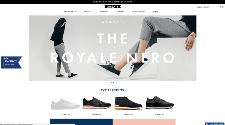
The great thing about Greats (pun intended, athankyou) is that it’s a “modern standard” on Shopify. It follows all the current trends of what people expect to see in an online store.
The product is obvious, discount credit is unobtrusive, site contact is “sticky” on the bottom of the page, and navigation is clear and concise.
You have easy access to all the information you need on this Shopify store.
Roden Gray

Roden Gray presents a good example of playing to your audience. From the top, Roden Gray looks like a standard site, with the banner and navigation up top - nothing crazy.
But if you keep scrolling down on the homepage, it looks nothing like a template. The content is scattered and almost chaotic.
This is definitely not the design choice for every business, but it works because this brand knows exactly who it is marketing to.
GroveMade

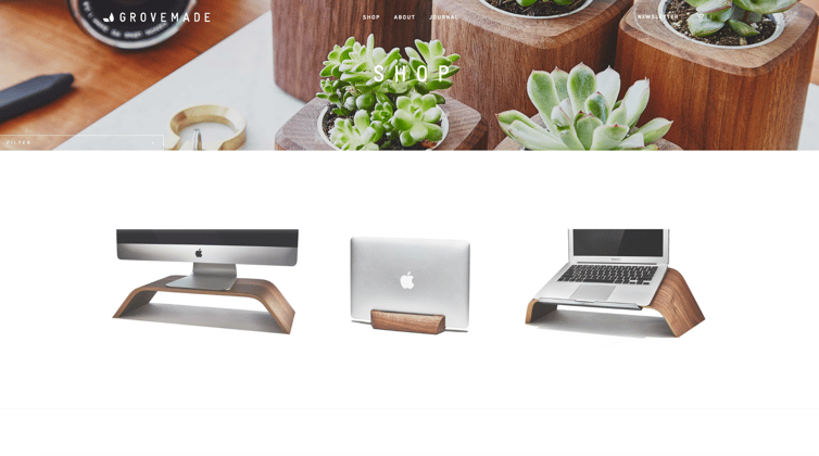
This Shopify store has an extremely minimalistic approach that perfectly mirrors the simple and elegant design of its products.
GroveMade went to great lengths to keep things as clean and sterile as possible on its website. Notice that no product information is visible until you hover over the product images.
It’s the little touches like this that unify brand, design, and products. Everything seen here is incredibly deliberate and strategic.
FiftyThree

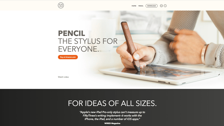
Moving on, there is FiftyThree. This website is a great example of the flexibility of Shopify.
Here, we see a modern solution for product education - site visitors learn more as they proceed down the page. Another interesting feature to note is that they don’t actually sell the pencil on the Shopify site. Instead, they send buyers to their Amazon store.
Online stores usually go beyond the homepage, but here FiftyThree takes advantage of Shopify as a landing page, and leaves the eCommerce to Amazon.
Penny Arcade

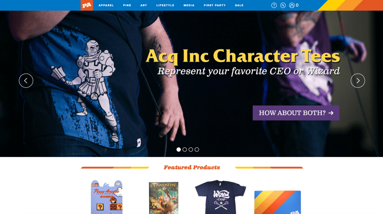
Last but not least, Penny Arcade is another example of the “modern classic.”
They utilize a striking header and brand-centric bright colors to bring life to the website. Your brand is absolutely critical to how you design your online store.
Now, bright colors might be the antithesis of your brand, but it’s incredibly important to integrate your brand’s own personality and voice into your design. You want your website to feel cohesive with the rest of your business.
SEE ALSO: 5 Tips All Shopify Merchants Should Know
Each one of these unique Shopify stores is inspiring.
However, when designing a website you need to do so with your product or service and audience in mind. So while one of these sites might work for one business, they may not be the best fit for yours.
If you’re wondering how you should design your website, or which platform to choose, EYEMAGINE is here to help.
Contact one of our eCommerce experts for a consultation today!

