
Presentation is important.
You know, I know it, and whether they’re consciously aware of it or not, your customers know it.
They can sense when a website’s design doesn’t meet their expectations, and they don’t have a high tolerance (or attention span) for lackluster sites.
The way you present your eCommerce business to online customers has a huge impact on your bottom line, so follow these 5 steps to improve your website design in no time.
5 Ways to Improve Your Website Design
1. Make it Responsive.
Responsive Web Design (RWD) is when your site is able to adjust to changes in browser width, and flawlessly reflow to tablets or mobile devices. This functionality has become critical to the health of your site ranking - Google now punishes sites that aren’t responsive.
So although making your site responsive can be quite an undertaking, it is an absolute necessity.
Here is an example of a website, Redfin, that does it right. Check out how the site looks on both a desktop and mobile device.


Notice how the homepage has a prominent key feature, that reflows perfectly down to mobile. No matter what device a client is using when they land on this website, they have a clear, simple path to the main branches of the site.
This is a goal you should shoot for in your website design.
SEE ALSO - The Value of a Web Development Agency: Responsive Web Design
2. Ditch the Slide Show.
Banner images are a standard at this point, so make sure that yours can scale, and make sure it’s static.
Ditch the slideshow because it makes a website feel cluttered. Most people won’t stick around for that second or third slide anyway.
Instead, replace the slider with a banner image and make sure it conveys pertinent information.
The human brain processes images 60,000 times faster than words, so a relevant banner image is key.
There are a ton of great examples of banners, but I enjoy the simplicity of Harry’s.
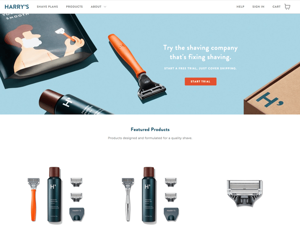
In fact, this website works well as an example for my next point too.
3. Avoid the Mess.
It’s all too easy for a website to become a cluttered mess of images, links, backgrounds, logos and text.
Keep things simple and give your landing page or home page room to breathe. If you have a lot of information you want to convey, start with what is essential to your business and move forward from there.
This is a great example. DoorDash knows why you came to their website. You want to find a place to eat.

When you visit their site, you aren’t going to see a bunch of links to food blogs and reviews, or lengthy explanations of their service, because that’s not what you’re looking for.
A key to effective website design: know your audience. (They’re who you’re designing for after all).
4. Test on Everything.
Test your website on every desktop, laptop, smartphone, and tablet you can get your hands on.
Make sure your images are clean, text is legible, and that there isn’t a weird horizontal scroll. It’s common to run tests on popular iPhones and iPads, but don’t forget to preview your website on a few Androids and other tablets as well.
Laptops, oddly enough, seem to get forgotten most often. Keep in mind that responsive reflow works with width. Check on laptops with smaller screens to ensure you’re not putting too much information below the fold.
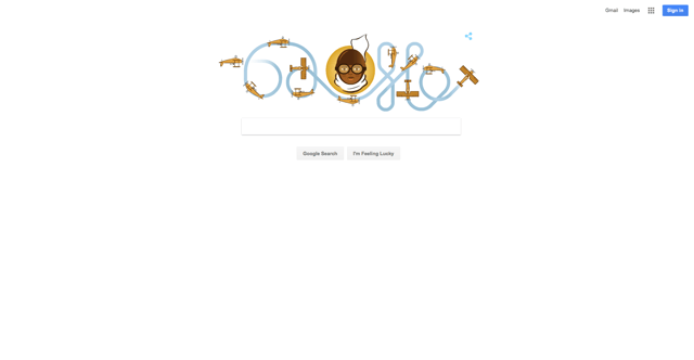
Google’s website design is so simple it can run on anything. Like seriously. Anything.
5. Use Heat Maps and Analytics.
This last step is by far the most important thing you can do to eliminate problems with your website design.
Every site is different because of how its users interact with it. A key to knowing how to adjust your website’s design is to simply watch and analyze your users’ behavior.
Install a Heat Map to see where users tend to view the most content, and where they fall off of your site. Analytics will help you see how long they browse, and common paths to conversion.
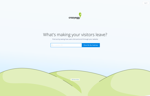
There are many reliable heat maps, but Crazy Egg is the one we use.
As I mentioned above, every website is different, and while these tips are largely universal they might not work for everyone.
Making changes to your website design needs to be thought out from every angle. Maybe you can’t decide on what your core message should be, or maybe you're not sure how to interpret your heat map or analytics data.
Let the team of web design experts at EYEMAGINE help. Start a conversation with a Marketing and Development partner, today.

