People have high expectations when it comes to your website.
They expect good web design. It's the first impression of your company.
Good web design = good products/services.
Bad web design = bad products/services.
Your website design, whether you're aware of it or not, is influencing your customers' purchasing decisions.
In March of 2015, we completely redesigned our website and migrated to the HubSpot COS.
We've been using HubSpot for our inbound marketing and its CRM so everything is integrated seamlessly for all team members across departments here at EYEMAGINE.
While creating mockups of the new site design, we wanted to emphasize our conversion rate instead of just focusing on the aesthetics.
And with HubSpot, we created great, high converting templates to make optimized landing pages on the fly.
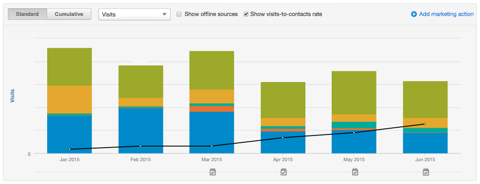
Integrated with well-placed CTAs throughout the entire site, we were able to increase our visit to lead conversion rate by 297%.
We had to hide the hard numbers for confidentiality reasons, but check out that graph!
The black line is the visits-to-contacts rate. By the end of June it tripled.
And to give you a better view of our contacts growth, here's a graph of our new contacts.
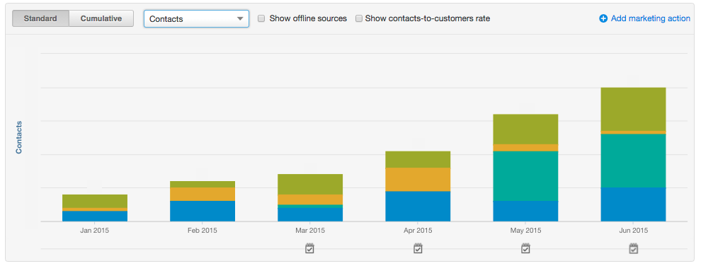
It's no question that the ROI we're getting on the website redesign made it worth the cost.
Drastic results take drastic changes, and that's exactly what we did with our website design.
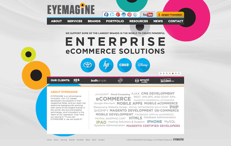
Here's what the site used to look like -
The first impression of the former design is that it could be updated with newer web design techniques and trends.
There are clear opportunities to add calls to action and content offers on the homepage, both top of the funnel and bottom of the funnel, to collect new leads.
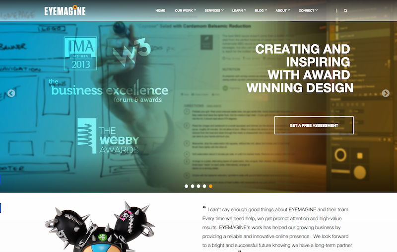
Now here is our current design. (click to enlarge)
Scrolling down the page on the new website, you can see there are many interesting CTAs for our services, case studies, portfolio, educational resources, and more.
Here's what our old landing pages looked like. Our old CMS didn't have landing pages, just a pop up without any information persuading the user to enter their email.
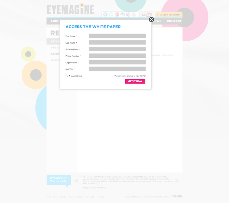
And here's how our landing pages look now:
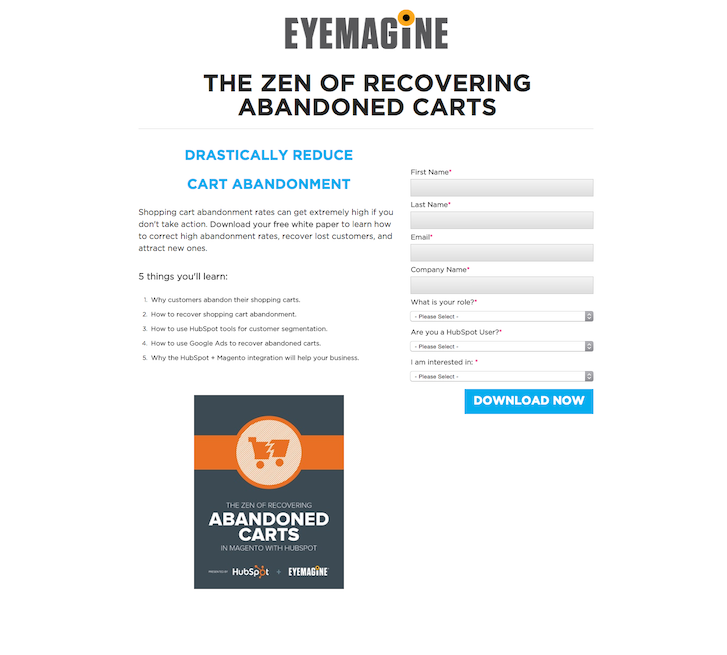
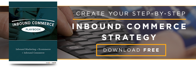
As you can see, to the left of the form is persuasive copy to download the eBook. This is where we give the user the major benefits and reasons to enter their information.
People need to see value before they give up their personal information. And as more companies are beginning to exercise inbound marketing, the quality will need to be constantly increasing.
In conclusion...
The new website redesign proved to be worth it - without question. Now all the traffic we work hard to bring to our site has increased in value thanks to a more conversion-centric design.

