eCommerce Design Trends
Websites are no longer simple additions to a business plan, they are a whole business venture unto themselves. Your eCommerce site is essentially a virtual shopping and business experience. As online shopping continues to evolve, eCommerce companies must innovate their digital storefronts to meet the customers expectations. If you would never leave your physical store dirty before opening for business, don't leave your eCommerce site in disarray. eCommerce web design is constantly trending towards innovative, clean, responsive layouts. These design trends are growing, not merely to act as gimmicks, but to showcase the evolving web world and how consumers are responding to more visually stunning web experiences.
In eCommerce especially, the consumer is asked to give an online store his or her personal information for a product or service. Because of that transaction-based relationship, it is within the eCommerce merchant's best interest to enhance its emphasis on visual appeal by being more design conscious, and giving the customer a shopping experience they will remember.
Below are 5 of this year's leading eCommerce design trends.
1. RESPONSIVE DESIGN
The general notion is to think about website experiences as a single fluid canvas of content that reflows content according to the browser dimensions.
To see a responsive website in action, check out our redesign for Magento Magnate. By dragging the edges of the browser window together and apart, you can see the site “respond”; the images and content on the page will shrink and expand to match the browser dimensions.
2. LARGE LIFESTYLE IMAGERY
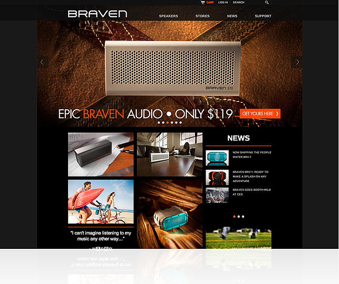
This eCommerce design trend is a page out of Marketing 101, where people want to see great visuals of the product in situations they can relate to. Enhancing the user experience with large imagery allows customers to visualize ownership of the product on display.
3. PERSISTENT NAVIGATION BARS
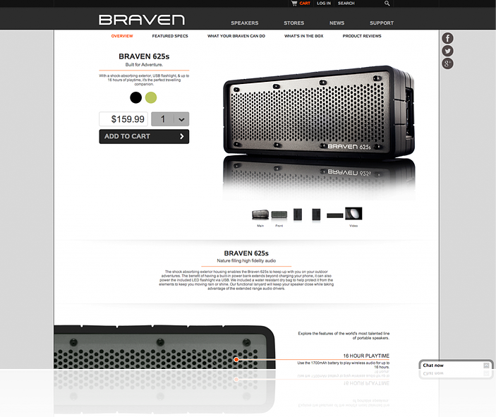
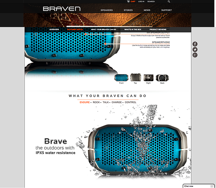
As visitors scroll down your page, a persistent navigation bar will offer constant support for navigation. This element of eCommerce design is very trendy and can achieve a beautiful aesthetic. Aside from the visual appeal, persistent navigation provides an exceptional user experience. The website maintains a clutter-free header without looking hard-to-navigate.
The Braven Product Page (above) offers a persistent header to allow consumers greater visibility of where they are within the product page. Moreover, this tactic is enhanced by combining it with the main header to keep customers free to jump around the site and accommodate those “A.D.D.” types.
4. LONG/INFINITE SCROLLING
Infinite scroll loading has been around for at least a few years. This technique has really taken off in later half of 2013. Essentially, the idea is to continually load content as a user scrolls down the page, resulting in a more natural customer experience. Pagination is basically a non-issue and removes an old detrimental obstacle in consumer navigation experience.
5. CUSTOM ART & ICONOGRAPHY
Newer eCommerce design trends are all about catching and holding one’s attention. Custom production art and graphics, including illustrations, perform this task brilliantly. Custom art, iconography, and illustrations enhance your brand's voice and evoke specific moods in your website, especially when studio prepared professional photography isn't an option.
Parallax background and custom art mixed with user interface iconography will give your brand a distinct feel; they will allow for a better user experience based on cognitive recall and recognition.


