eCommerce success is heavily influenced by user experience (UX); do it right and you can make your numbers, do it wrong and you'll be in the red.
Think of the websites that you shop at regularly. Apart from the actual products or services, what is it about them that appeals to you and keeps you coming back? Is it:
- The ease of navigation?
- The clarity and conciseness of content?
- The degree of custom personalization that you experience each time you revisit?
It's probably a combination of the above, as these are some of the many important design factors that comprise an awesome user experience (UX).
Overall, UX should be intuitive and efficient to encourage visitors to trust you, buy from you and keep coming back for more. Here, we explore 6 UX tips that will boost your online presence and increase your revenue, converting your traffic into loyal returning customers.
1. Increase Your Website Speed Through a CDN
Slow page load speed is a massive deterrent for customers: each lagging second brings them one step closer to bouncing from your site and either heading over to a competitor's site or just abandoning their cart altogether.
How much does page load speed affect the common eCommerce retailer? KissMetrics published that, ”if an e-commerce site is making $100,000 per day, a 1 second page delay could potentially cost you $2.5 million in lost sales every year," which means that those lost seconds add up in a big way over time.
Increasing the speed of your site through a content delivery network (CDN) is a crucial solution to this problem, especially if your eCommerce site has a global audience. Why? Using a CDN reduces latency time and increases page load speed.
Let's break it down: a CDN is a network of servers that delivers web pages and content based on the geographic location of a user, the origin of a webpage and the content delivery server. This means that when a user requests to see a page that is part of a CDN, the server that is geographically closest to the user responds to the request and sends the requested page. This reduces the amount of time it takes the host server to receive, process and act on requests for page resources - and increases the chance of your customer sticking around on your site.
SEE ALSO: Magento 2.0: Things to Consider Before Switching Platforms
2. Suggest Supplementary Products on the Product Page
In a supermarket, things that relate to each other go together. You’d never, for example, find toilet paper far away from the paper towels. Why? Stores are usually laid out so that customers not only find what they want, but also have the opportunity to check out similar items that may interest them.
An eCommerce retailer's online store should be designed the same way: this kind of product discoverability is one of the most important UX elements in online retail.

By suggesting supplementary products, accessories and add-ons on the actual product page, retailers can streamline their customers' shopping experience, providing them with everything they might want in one central location. This kind of upselling and cross-selling always translates into increased conversions, average order value and revenue. Why? If customers constantly have to go back and search through categories to find the supplementary products that they are looking for, they are more likely to get distracted and bounce from the page. Conversely, if these products are readily available, they are more likely to stay, shop and convert.
3. Include a "Recently Viewed" Module
Making customers use the “back” button to revisit their previously viewed items is like edging them towards the back door and out your shop - it's an extra step that most potential customers are not interested in taking. From their perspective, once the item is out of sight, it's usually completely out of mind and not worth the effort of relocating.
That's why we recommend that you save your customers the hassle of having to re-find items by including a “recently viewed” section in either the footer or in a more prominent sidebar of your site pages. Why? Customers are more likely to expand their product searches if they know that they can easily navigate back to where they were or review items that caught their attention along the way.

Including a “recently viewed” module on every page, then. not only helps customers compare products and check the compatibility of accessories, but also encourages them to explore a previously visited category even further. This could result in a fuller shopping cart and more conversions down the line.
4. Use a Fixed Navigation Bar for Mobile Devices
We live in an era of smartphones and mobile devices: today, more than ever, people are using their phones and tablets to browse websites, read emails and do their online shopping. Even further, research published on KissMetrics shows that 78% of mobile searches for business information result in a purchase, which means that not only are people using their phones - they're also buying on their phones.
From a UX perspective, then, having responsive mobile navigation is a completely essential part of any eCommerce marketing strategy. A quick way that eCommerce retailers can create this positive mobile UX is by including a fixed navigation bar. This helps users - no matter where they are on a page - to quickly get the information that they need without scrolling back up, which means maximum content, minimal effort, and increased conversions overall.
5. Use a Clear and Attention-Grabbing Call-to-Action
Attracting site visitors is only half the battle: once shoppers have landed on your homepage, they need to be motivated to move along in their buyer's journey and convert into paying customers. An effective, enticing call-to-action (CTA) is a quick and easy way to make this happen.

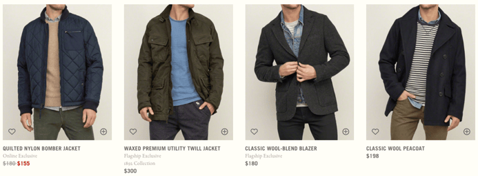
So what does an effective CTA look like? It depends on a variety of factors, including audience, brand identity and website page. Abercrombie & Fitch, for example, converts customers by offering a minimalistic, clutter-free browsing experience, while Zappos draws its customers' eyes to their “add to shopping cart” button by making it bright orange and hard to ignore.
Test the following by measuring conversion rates:
- Test colors
- Use elements like eye-catching hero images for limited-time sales
- Play with your copy
- Keep the wording simple
- Always ensure that your CTA is a highly visible, above-the-fold button
Once you have different options, make sure to A/B test and consult your analytics to see what your site visitors are responding to and determine what really works for you.
6. Simplify and Secure the Checkout Process
There are two parts to having a successful UX strategy. First your UX design needs to draw users in and make it easy and inviting for them to find the products that they want. Second, it must encourage them to quickly and efficiently make their purchase. How? By offering a simple, easy-to-navigate checkout process that highlights security and trustworthiness.
Specifically, retailers should:
- Automate the order process so that things like availability, colors, sizes, add-ons, payment methods and shipping details all display on the same page when a user selects a product.
- Automatically add in phone codes when a customer selects a country
- Include a progress bar that shows customers where they are in the checkout process
- Clearly convey a security and privacy policy on their checkout page
- Add text confirming that the payment process is secure
These elements not only work to reduce clicks and improve UX, but also establish authority and reliability, thereby building your customers' trust and increasing the conversion rate and lifetime value of each site visitor.
Key Takeaways
For any eCommerce website, the customer is king. This means that retailers have to do what they can to give their customers a positive, memorable shopping experience. Creating a UX design that is easy-to-navigate, attractive and high-converting is a quick and effective means of accomplishing this task and creating a successful online presence. Not sure if your eCommerce site is getting the job done? Maybe it's time to contact an eCommerce marketing specialist to get a site audit and see exactly how your site stacks up.


