
User Experience (otherwise known as UX) is your site’s ability to ensure every user has a good time. It’s ease of access for information, simple navigation, and lack of friction—the little things that few people notice, but that can have a big impact if they don't work well.
That said: bad UX will not only affect conversions, but the overall view of your brand. A key component of making sure people think possitively of your site is is the User Interface (or UI)—how people interact with your site. Here, we’ll take a look at a few sites that have a User Experience perfectly tailored to their audience, to give you a better idea of not only what to strive for with your UX/UI builds, but how other companies did UX right.
1. Amazon
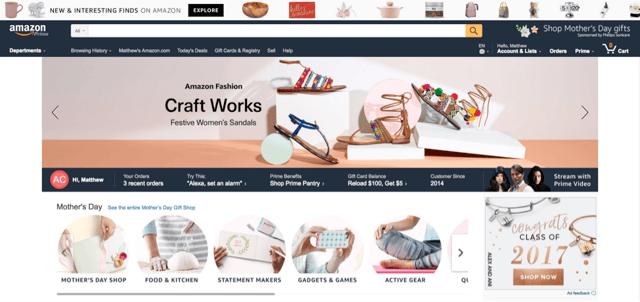 If you’ve bought something online recently, chances are pretty high that it was purchased on Amazon.
A long time ago, this colossal retailer was an example of exactly what NOT to do with your User Experience: clunky, unintuitive, and ugly. Somewhere along the line Amazon decided to do something about it—and now their site is a fantastic example of catering to your customers needs. It’s easy to shop regardless of the device you’re on; whether on desktop, tablet, mobile site or app, the new Amazon site tailors itself to the best experience. It also does a great job utilization cookie sessions to remember you, recommend new products, and politely reminds you to treat yo’self.
2. Netflix
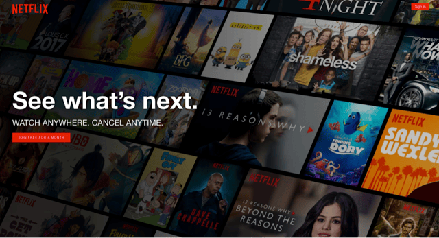
It seems like a lot of people have forgotten that Netflix actually started as a service that would simply mail DVDs from your queue. Today Netflix they are synonymous with streaming, which they were smart enough to prepare for given how hard into the streaming market they leaned from almost the beginning.
Streaming posed a unique challenge though—Netflix has a huge catalog that is browsed casually as often as it is searched specifically. The simple, elegant solution of scrolling horizontal categories based on consumer info is why Netflix is a household name—and why didn’t end up going out of business, like physical competitor Blockbuster.
3. Vivino
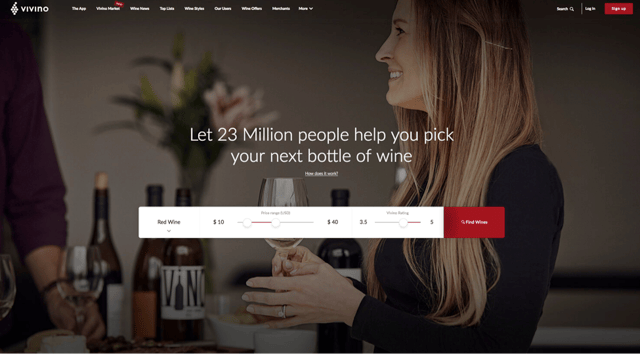
Wine as loved as it is old (that is to say, very loved, and very old). While ordering alcohol online is still relatively new (and not even legal everywhere) there are new sites and services popping up to fill the void. A prime example of this is Vivino.
Vivino does a fantastic job of guiding the experience and allowing you to tailor a selection right off the bat. Since wine as an industry has a huge amount of enthusiasts with little education, the filter they present right off the bat is perfect—all the user does is enter price range and rating and go from there. It allows the customer to feel comfortable with the first results they’ll see in what is I’m sure a daunting catalog.
4. Blue Apron
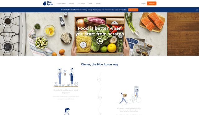
I am a huge fan of scrolling sites as informative as they are fun. I call them “scrollducation” sites—only no I don’t, because that's awful.
If I did though, Blue Apron would rank as high as any: the homepage does a fantastic job educating newcomers on the surface while also, if you’ll pardon the pun, baking in Call To Actions at each step. They also have a great consistency throughout the site with the number 3. Everything is broken into three easy steps.
5. TeeFury
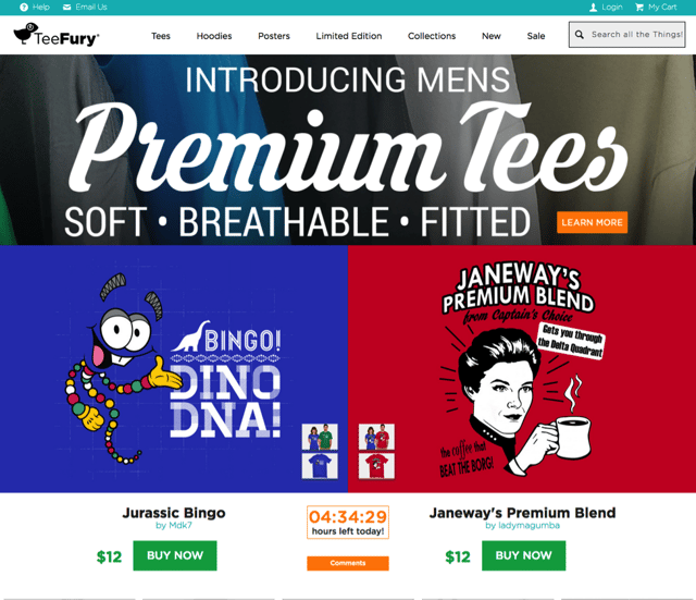
This site made the list because it is a great example of how to think “outside the box”.
Teefury is more than just a site, it’s an entire business model. Everyday, they have two T-Shirts go head to head. The shirts are affordable, exclusive, and only available for 24 hours. They have essentially crafted a custom UX, specifically for their clients. This model encourages urgency in purchase, and while it’s definitely a niche and can’t be applied everywhere, it works.
6. Hardgraft
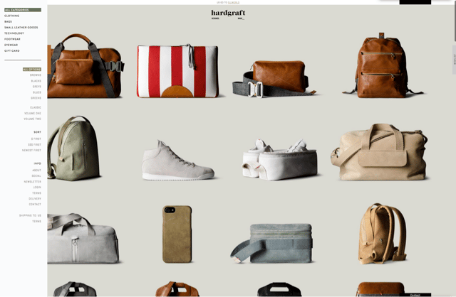
Hardgraft is a great example of modern eCommerce. When you arrive, you are presented with the brand, the whole brand, and nothing but the brand. New products right up front, with Navigation to the side. This is an incredibly bold approach that I would not recommend for everyone, but it’s often all too easy for eCommerce stores to feel old, stale and “samey”. Hardgraft feels fresh as the day is long.
7. Bav Auto
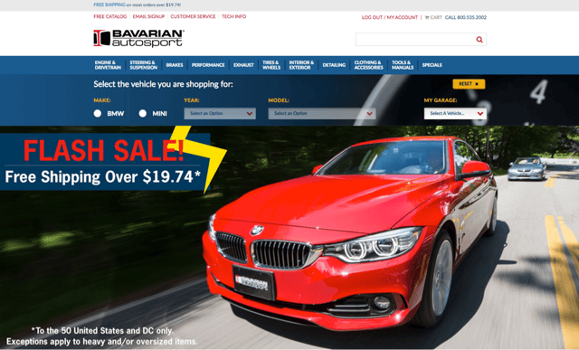
Bavarian Autosports recently launched a new design that features a wonderful UX improvement: the car filter. Being a car site, with parts and accessories for hundreds (if not thousands) of models and years, their clients needed a way to filter through all the variables that come with their automobiles, and the filter allows you to do just that.
Select and save BMW/MINI models to a virtual garage, and the filterwill search products based on that criteria. This innovation allows users to shop with confidence that the part they’re looking at will fit their 2003 XRi Turbo.
8. Go Bag
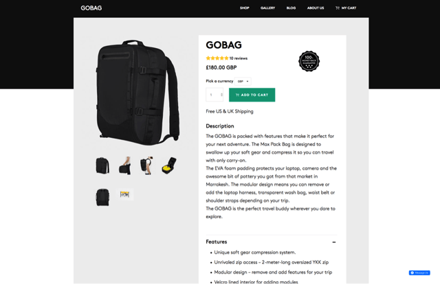
Go Bag is another great example of “Scrollducation” (And, fortunately, that’s the last time I’ll use that phrase). Go Bag does a fantastic job of keeping it simple and kinetic. They carry over the style of the homepage to their product page, giving it a cohesive feeling that really make the pages pop.
Final Takeaways
Great UX is so much more than just style and a good design. It takes a team dedicated to knowing your audience, brand, do’s, don’ts and everything in between. Curious if you’re site is up to snuff compared to these? Contact EYEMAGINE for a UI/UX audit today to find if you have any holes in your usability.

